Looking for an image/illustration to analysis for my visual culture essay...
Welcome to my Blog - Enjoy!
Friday, 30 October 2009
Promo Print Work: Profile of Yourself as a Visual Communicator
My name is Mary-Anne Trant and I am currently in the first year studying Visual Communication at The Arts College at Bournemouth University. By being a visual communicator my primary aim is to convey messages graphically or visually. This can be achieved by having a variety of skilled techniques, as well as a visual sence for creativity. I enjoy being able to solve problems by creating a visual response.
Thursday, 29 October 2009
Letter Press
On the 21st of October i learnt a new typography technique - Letter Press.

We could choose from a variety of wooden letter blocks - capital; lower case; condensed; expanded and several ligature's. We had an assortment of colored oil inks to roll onto our wooden blocks and then compress them on the letterpress machine, so that the ink printed onto paper. The paper was slightly damp, which gave the text an embossed effect. Some of the wooden letters had slightly chipped rough surfaces, which gave a really appealing sketchy feel.
I then explored my new learnt technique by using a variety of different colored papers; applying the text to fabric textured backgrounds; using tracing paper to overlay onto more text etc.
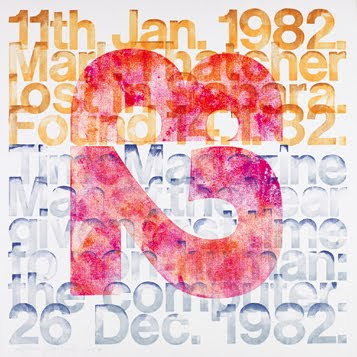
This is some of the work by the letter press designer Alan Kitching
Here is one of my outcomes of Letterpress - Exloring the idea of Expand. The words expanding around the centre.

Tuesday, 27 October 2009
Intro to Grids and Layouts
We had to work as past of a team to compose the layout for a 6 page magazine. I enjoyed working in a group as we got to share and explore each others ideas. We all individually did our own layouts and then merged them together to create a 6 page layout; which had a constant flow and variety of image/text shape. This exercise also gave us a taste of a real life timescale as we had to race against the clock!
Saturday, 24 October 2009
Tuesday, 20 October 2009
Type and Tape Task
Devise and design a typeface using tape. Create a name and characteristics of the typeface.
However, we did not get to finish our creation as we got told of for blocking the fire exit! Therefore, we finished our typeface with the name 'Dive'. This also worked well with the position of the type; as you had to physically dive under to get past!


Our typeface, which we named 'Diversion', was built up from lengths of tape crossing through a hallway, with the text in the centre of the cross. This literally caused a diversion to get through!


Subscribe to:
Comments (Atom)


